Reading Lists for Lighting Artists
September 01, 2013, updated August 27th 2014.
When I was in high school, one of my favorite things to do was to hit the library, check out all kinds of books in a particular section of the Dewey Decimal and read them over the course of a week. To this day, I still lean on printed books for a majority of my deep thinking about any subject. Call it a generational thing, or the fact that needing a publisher and a market keeps a certain quality bar in place. The length of a book allows considered exploration of a subject in a way that a simple how-to tutorial cannot provide. I’m not saying that you cannot learn from blog articles, youtube videos, or other online learning resources. That’s just not what this post is about. Each of these books is quite rich and will merit many readings.

by Virginia Wissler
Illuminated Pixels is an extensive overview of digital lighting for film and animation. There are chapters that focus both on the technical and creative aspects of lighting, giving a very strong foundation for the digital lighter. Wissler presents the topics in an easy to understand way, with plenty of illustration and explanation. I highly recommend this book to beginning and intermediate digital lighters.
by Richard Yot
This book is a must-read for students of light and surfaces. The author covers a wide area of topics, and creates a very clear picture of how lighting affects any visual composition. The book is based off the author’s work on his web site: Light – A Detailed Tutorial. Many thanks to Gavin Vaden for pointing me to this resource.

by James Gurney
This book was recommended to me by Marissa Erven, a co-worker of mine from Hidden Path, as well as a few of my co-workers at Bungie (Mark Goldsworthy, David Brumbley). Because it is a book on painting, theres a fair amount dedicated to traditional painting techniques. Gurney does very good coverage on choosing palettes and color combinations, as well as visual perception.
by Stephen Quiller
Ive owned this book since high school. I come back to it every year or so for a re-read. The strength of the book is in its clear examples and explanations of many kinds of color schemes, including how to think about which colors should be dominant and subordinate. All of the examples and color wheels are given in traditional watercolors, but the theory is sound for artists in all medium.
by Jeremy Birn
Ive been following Birns work, since his MFA thesis work at Art Center College of Design. His book is a good place to start for users transitioning or beginning their work in 3D CGI. Theres broad coverage for lighting, shading, texturing, rendering, cameras and color. While other of the books listed here do a better (and perhaps more timeless) presentation of the material, this will give you a good foundation to start from.
by Hunter, Biver and Fuqua
This book was instrumental in helping me understand the relationship between materials, camera angles and lighting. It was so useful, I was inspired to write a few blog articles based on the explained techniques for lighting glass on a dark field and a light field.
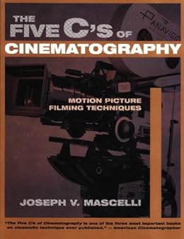
by Joseph V. Mascelli
This book isnt strictly about lighting, but it has been helpful for me in understanding setting up cameras, and will be of assistance for lighters wanting to understand how to light moving shots, and how lighting and cameras interact. It will also teach you a great deal about setting up cameras for moving pictures.
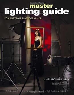
by Christopher Grey
As lighting artists, it behooves us to think about how to light the human face and body. Its a subject well run into often as well as a good stand-in for other complex forms. Ive read a number of books on portrait photography and lighting, and this one is a standout. Theres a lot of discussion in the book about contrast ratios and hard/soft light, which are applicable to any lighting assignment. Since its a photography book, all of the examples are given from a photographic perspective. However, most of the information translates well into 3D CGI.
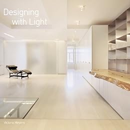
by Victoria Meyers
As lighters, it can be up to us to look for opportunities in the sets and environments we light to create more interesting scenes. Each chapter is a photographically illustrated breakdown of how different elements of architecture and light can work together to create compelling spaces.

by Marietta S. Millet
Light Revealing Architecture is a set of detailed studies of architectural projects in regards to how they were designed to facilitate the best possible use of light. Millet covers architectural concepts in form and materials that will be important for lighters to understand. Theres a lot of deep thinking about the subject of architectural light in this volume that will reward you with each additional reading. I credit Millet for showing me how brilliant Le Corbusier and Gaudi were.
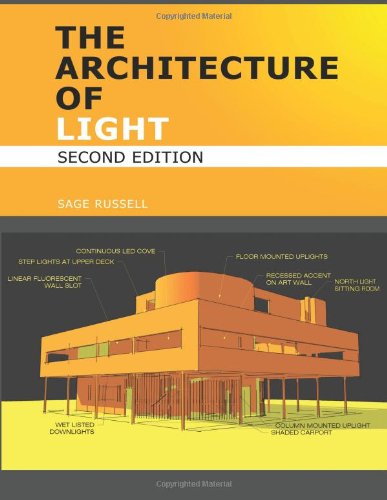
by Sage Russell
I recommend this book with reservations. The concepts and explanations given forth are excellent and worthwhile. However, the design and editing of this book are terrible -which includes the rendered examples that contain numerous (but not fatal) errors. This book is most useful in its explanation of how to design lighting for architectural spaces. Read it, but be prepared to cringe at some of the editing and all of the typography.
Fading Daylight - Artistic Process
October 22, 2012

This article is a breakdown of my lighting process for a piece I created recently. The inspiration for this piece came from my feeling of a winter sunset under a partly cloudy sky. I wanted to communicate the beauty I see in the quality of the soft, pink sunlight, and the luminosity of the light bouncing off the snow. I wanted to hint at a feeling of loneliness from the quietness that a layer of snow brings to the world. I wanted a create a room that would communicate the quiet grace of the scene I imagined outside of it.
The base of the lighting rig for this scene consists of a mental ray daylight system with both a physical sky shader and a sky photograph I found on CG Textures. The sky photograph was mostly cloudy, with a break in the clouds at the horizon. I color corrected that sky to have pink/yellow at the cloud-break, and a just barely blue cloud layer to inform the cooler interior fill light. Without the cool fill inside the room, the scene was cloyingly sweet, losing its sense of wistfulness.
I wanted the compositional focus of the piece in the interior of the image, so I could pull the viewer into the space. To do this, I created areas of higher contrast with sunlight patches and bright sky through the windows. I didnt want the whole table to be bathed in bright light, because I felt that would draw attention away from the rest of the room. I used low, raking, but visually horizontal light patches to create stability in the composition, and lead the eye into the scene. The table is turned a little so the far edges catch light to help define its form.
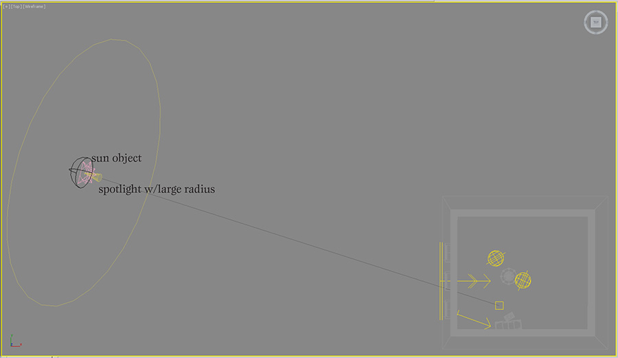
Working with the daylight system was a bit of a challenge in this scene, because the color of the sun is not directly controllable. However, I needed the soft shadows and parallel light to simulate sun coming through partial cloud cover. To create the appropriate pink colored sun, I turned down the intensity of the sun object and added a very bright photometric spotlight with a narrow cone angle. The shadows from the windows didnt match up exactly between the two lights, so I softened the spot light shadows to blend in better.
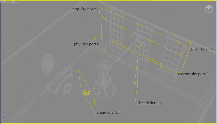
The sky part of the daylight system is not used directly, but my custom sky material is assigned to a large sky portal outside the windows. I found that the light from the custom sky was too pink, so I added another sky portal behind the first, and assigned the physical sky material to it. That allowed me to mix the physical sky with my custom sky to get the balance of warm and cool colors I was looking for. This could have also been created by mixing the mr physical sky with the image sky in a composite map, but I felt like having the sky controls split into two objects gave me a more intuitive, flexible control system.
I had an issue where there was too much contrast in the image from the dark areas in the room on the side of the window wall. I lightened them up by adding another set of physical sky portals in front of the curtains. This gave a better simulation of light coming through the curtains and brought out the rooms textures more. I reduced contrast in the image further, by adjusting the tone mapping to smooth out the bright tones and raise the mid-tones.
The chandelier needed a little special attention to make it read well, so I added a few area lights around it. The key light for the chandelier is cheated to make it look like its coming from the window direction. This makes a nice gradient across the shape of the candles, and creates a form-defining reflection on the right side of the chandelier. The other light comes from the left and front of the camera, almost like a rim light. It provides just a touch of fill, so the wax doesnt look too dark on the shadowed side, and adds a bit of soft reflection on the left side of the chandelier.

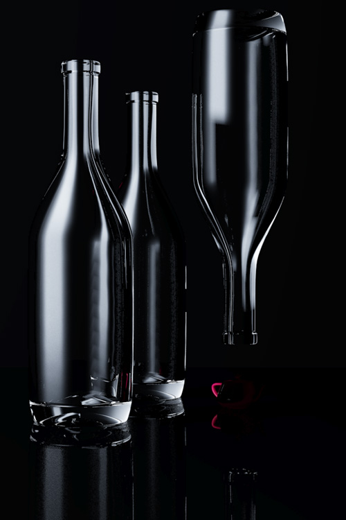
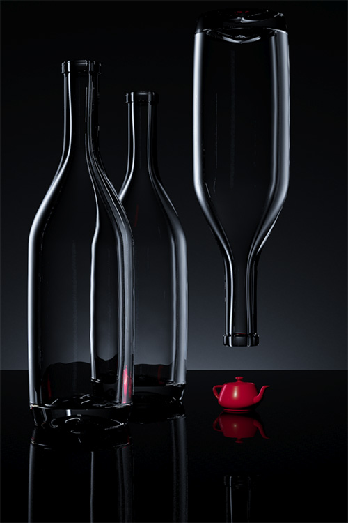
Clear Glass on a Dark Field
February 2, 2012
This is a follow up article to the one I posted most recently on how to light clear glass on a light background. I will refer back to that article, so it may be helpful to look at it before you read this one.
I started this exercise from my white field file. My initial thought was: just invert the background color to black, and put a white card where the black cards were. Problem solved! However, the solution was a little more complicated.
The key differences between the light field lighting scene and this dark field scene are:
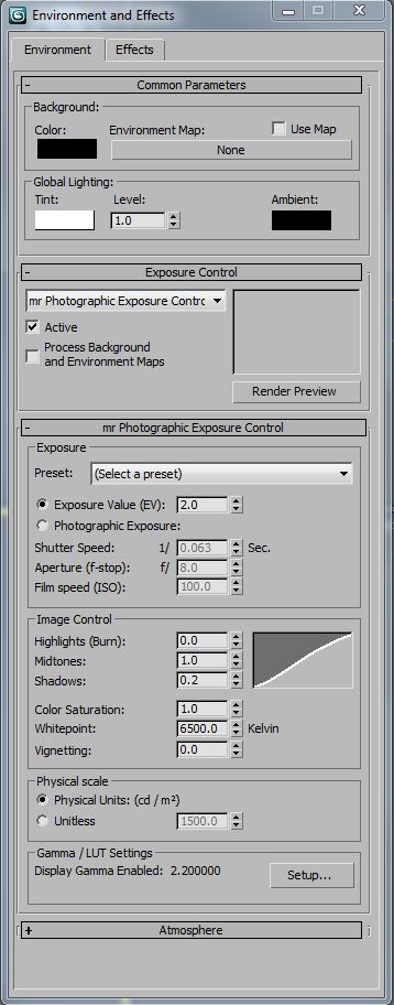
I used a night time interior level of exposure control (2 EV), which I should have used in both studio scenes. Its important to set the exposure property, so that your lighting will behave realistically when global illumination is calculated. In these particular scenes, almost all of the reflections are direct instead of diffuse indirect, so its less important to match exposure and light values. However, its a good practice to specify real-world light and exposure values, in the same way its important to model at real-world scale -Your renderings will be more predictable.
I wanted a narrower field of view to control the direction of the reflections on the bottles, so I lengthened the lens. In order to keep the same image size of the bottles in the frame, I moved the camera back away from the scene. Because of this, I had to make the table longer, so it would fill the view without a gap at the bottom of the frame.
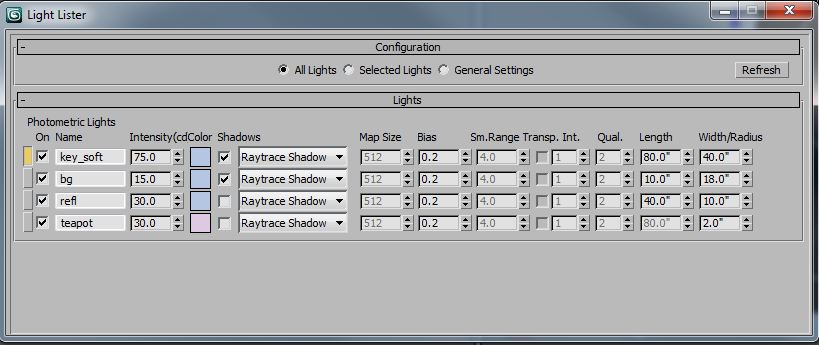
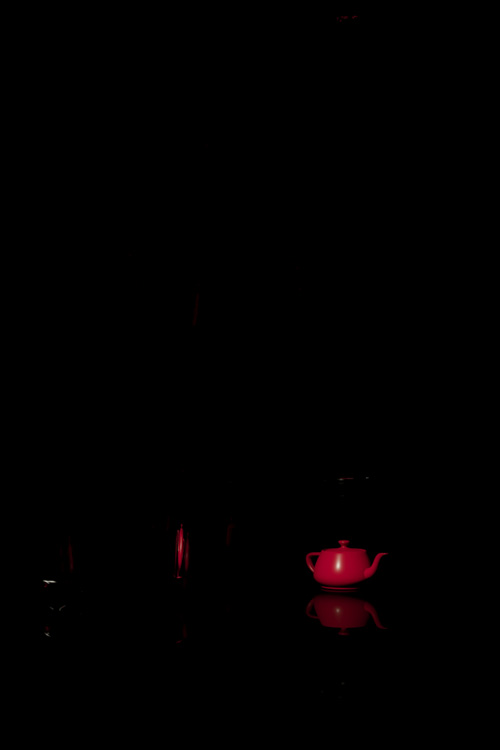
Notice how the background (bg) light and the teapot special light dont cast shadows. This is a rendering optimization, since shadows are not needed on those lights. Like my the white field scene, Ive added some color to the light sources to make the scene more interesting. In this one, most of the light sources are blue, since this is a near monochrome scene. Because there is so much blue in the scene, I made the light for the teapot complimentary, so it neutralizes the color of the teapot to read more red. Without that, the red teapot would render closer to purple.
The edge reflection (refl) light could almost be a white card. It mostly just needs enough illumination that it reads white in a reflection, which is different than actually casting diffuse light into the scene. The key light (key_soft) has to be a lot brighter to keep up with the edge reflection values.
The background materials are quite dark, since they are supposed to read as (almost) black, even under the heavy light of the key and bg lights. The diffuse values are in the neighborhood of 0.01 for diffuse contribution and 0.02 for the diffuse color. Essentially, they reflect very little diffuse light. The table material has a high amount of reflectivity, which is why it picks up the reflections of the glass bottles.
I adjusted the glass bottle material as well. This material has almost no diffuse and is almost totally transparent. I made these changes because I wanted the bottles to be all reflections, and not pick up any diffuse lighting. I think this looks better on the dark background.
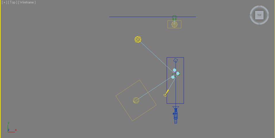
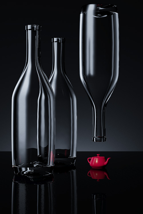
Here are the lights, one at a time:
Background

Reflection

Key
The teapot “special” light – notice that it’s a little warm to help neutralize the other blue lights in the scene.
Here are all the lights except for the key:
Here are all the lights except for the key. This feels good, but lacks a little interest.
All the lights together!
Clear Glass on a Light Field
January 23, 2012
I recently purchased the 4th edition of Light Science and Magic: An Introduction to Photographic Lighting. It is one of the best books on lighting and surfacing Ive read. The aim of the book is at photographers, but for people with an intermediate rendering background, it offers a lot of information on how to light (and therefore create) the basic kinds of surfaces we see in the world. Throughout the book there are exercises in lighting, most of which can be done with a very simple studio set up. However, I thought it would be fun to take some of the lessons into the 3d rendering space in order to deepen my knowledge of surfacing and lighting.
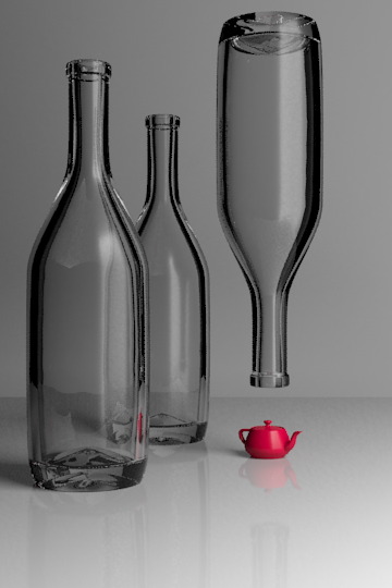
The first exercise I took on was that of lighting clear glass bottles on a white field or background. This presents a bit of a paradoxical problem. Most people understand that transparent, reflective materials look like what is behind them and what is around them. Lighting clear glass on a white background might seem like an impossibility, since in the white background there is very little to reflect or refract.
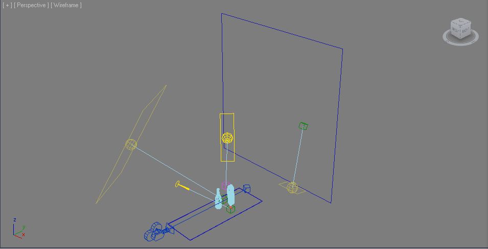
The secret to this exercise is knowing that the background outside of the cameras view must be dark. This requires delicately balancing angle of view and background size -and a lot of test renders. Heres a shot of the scene set up:

There are three glass bottles sitting on a white, reflective surface. The background is a matte while. There are three lights in the scene. A softbox key light about 45 degrees to camera right, a sky fill light above the camera, angled down to the scene and a background light. As you can see, the table surface and the background are not much longer than the total scene. My first inclination when creating this image was to use a wide angle lens. I knew that the bottles needed to reflect the blackness of the environment background, and that the wider the view, the more angles Id see off the bottle. The problem I ran into was with a wide angle view, I needed to have a very long background plane to cover the whole camera view. The background plane was so large, it obscured the dark environment that I wanted to use to define the edges of the glass. I slowly brought in the angle of view and the background plane, until I got just the right amount of black environment reflected. At this point, I was only working with the background light, since I was only interested in illuminating the surface behind the glass, so I could tune the reflections of the black environment.

This rendering is with the background light only. Its not actually a bad rendering, but its more like clear glass on a dark or mixed field. Its worth discussing the glass material at this point. I started with the Arch&Design Physical Glass. However, I had to tune it a little bit to get the results I wanted. Heres the modified material:

The main differences between the stock material and my material on this panel are my addition of a little diffuse and a little less reflectivity. This simulates the effect of a little dust on the surface, and helps the glass pick up a little bit more light from the light sources. Ive set the reflection Max Distance to the extent of my background so theres no wasted time tracing rays out to infinity.

This panel shows a few key things. The first is the Max Distance for refraction. The smaller this number, the faster glass goes to its override color (or blackness). This is an excellent way of simulating partial transparency, since its a distance based effect, rather than just a single scaling value. Ive made the distance a little shorter than the stock 30?, just for fun. I also unchecked the Color at Max Distance, since this will tint the areas of the glass that we want to be reflecting the black environment. Ive disabled the optimization of Visible area lights cause no reflections, because Im using a large key light softbox to create a reflection in the front of the glass. Another touch I added, which makes a lot of difference in any reflective/refractive material is the addition of small surface perturbances. In this case, I used a simple noise with a very small bump amount.
The next light I added was the area key light, which creates a large, highlight on the front of the glass. This evokes daylight coming in through a window, and to the trained eye, a photographers studio. As suggested in Light Science & Magic, it might be a good idea to put a loosely spaced grid in front of the light to simulate the mullions of a window. It just depends on the look you are trying to achieve.
The key light also doesnt make a bad picture all by itself, but it lacks contrast without a brighter background. I put in a third light just for fun. It adds a little color and fill light to the whole scene. I tinted it blue, since people tend to associate blue with glass and water. This is because if were outside on a sunny day, reflective objects will reflect the blue sky. In the case of this image, its pretty subtle.

You can see the reflection of the large area light square in the angled parts of the bottle. The reflection of a large light is good for showing off the contours of curved objects. As a teaser, heres the scene with a diffuse material on the bottles:
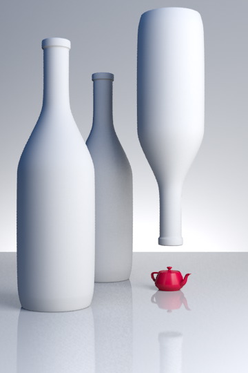
My normal process for lighting a scene is to put a white, diffuse texture on everything. However, when the scene has a lot of reflective or refractive surfaces in it, this is not a sufficient process. Starting with the reflections and refractions is a better way, since they are dependent on so many other factors. Diffuse lighting, by its nature is much less angle and environment dependent . It would be hard to predict that the following scene would look like this, when the transparent objects were added:
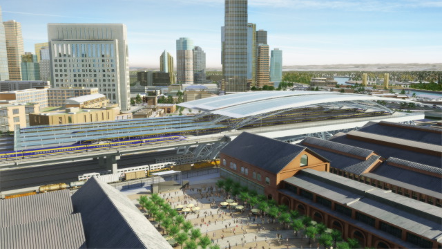
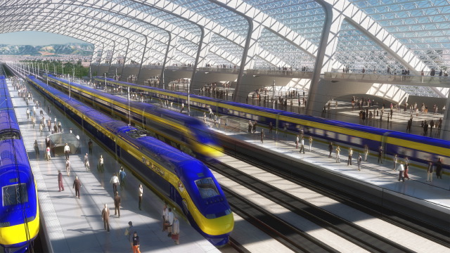
Lighting Post-Mortem: California High Speed Rail
January 8, 2012
In 2006 I took a job with Newlands & Company (NC3D), a visualization firm that does a fair amount of trade in transportation projects. During my two years there, most of my time was spent leading animation production for one of our larger clients, The California High Speed Rail Association. Everything in this article is from my experience at that time, on that project. As with any tech company, I imagine things have changed quite a bit in the years since I left.
At the time I took the job, it had been a number of years since I had worked with pre-rendered images. I had been primarily creating real time lighting in games up to this point. The transition was somewhat tough, but strangely enough, one of the primary considerations of both real-time games and animation sequences are frame rendering times. I forget who to attribute this to, but I heard (probably on an FXGuide podcast) that animation studios all have a particular frame time that they are used to, and even as technology advances, they keep pretty near the same frame times. I suspect this has something to do with the expectation a person has for how long an image should take to render. It also probably has to do with how people are used to estimating time on projects.
We primarily worked in 3ds max using Vray as our rendering engine. We used Combustion and After Effects for compositing, as well as a number of support tools like Onyx (for trees), VirtualDub for previewing animation, Autocad for GIS work, and Photoshop for still images and textures. In addition, we had a number of in-house tools created by our technical director.
The lighting for most of the shots was to be idyllic, sunny Californian days. This was a fairly easy lighting task from a creative standpoint. I think the real story of lighting on this project was our movement from direct-only lighting, to a global illumination rendering pipeline -something I was not there to see the end of.
When I started, a common outdoor day lighting rig used 3 lights. There was a single, warm direct light for the sun and two, cooler direct lights, usually placed 120 degrees from each other, for sky fill. I worked with this rig for a while, but changed when I learned a great technique after watching Environment Lighting for Production by Tim Jones (Gnoman Workshop).
This image shows our 3 light rig in action. A link to the animation.

The technique he showed was how to use arrays of spotlights for sky dome lighting and ground bounce lighting. The arrays are created by placing spotlights in a dome shape. The lights in the sky array have a cool color and cast shadows down towards the center of the scene. The ground bounce light is created by making a dome array of warm, non-shadow-casting lights below the scene, pointing to scene center. I adjusted the ground dome light positions so that the light would come more from the bottom of the scene than the horizon and set the ground lights to fall off over a specific distance.
I found that by optimizing the number of lights in my arrays, and which of those lights cast shadows, I could get better render times than using a Vray dome light. The dome light (or environment light) can be a simpler way to work, but I needed the flexibility of the light array to optimize render times. Its worth noting that noise in image sampling, global illumination, soft shadows and glossy reflections were major hurdles in keeping render times down. For that reason alone, we avoided using GI for most of our animations.
This image shows our dome light rig with area shadows. A link to the animation.
As I learned more about rendering and compositing, I wanted to introduce ambient occlusion into our render pipeline. Ambient occlusion is essentially a monochromatic shortcut for rendering soft shadows cast by large light sources, such as the sky, or the bounce light shadows in a diffusely lit interior. At first, I tried Vray Dirt to simulate this ambient occlusion effect, but I was not pleased the effect. It didnt render like a sky shadow and it was slow to render smoothly. Mental Ray seemed to have a superior look and faster renders, but there were a number of problems with it as well.
The first problem with rendering an ambient occlusion pass, is that it takes extra render time and set up. This isnt really a problem if theres only one render layer, but we had many layers. The second problem we had using Mental Ray to render ambient occlusion was that the Vray Proxies we relyed on for our trees and other high detail objects, didnt render accurately in Mental Ray. Only the low detail preview geometry of the Vray Proxy rendered in Mental Ray, so the renderings from Mental Ray did not composite accurately with our Vray renders.
After experimenting a bit, I was able to get the subtle sky shadows of an ambient occlusion render by setting the sky array lights to cast (Vray) area shadows. This definitely added to the render time, but it had a couple of key features:
At some point during my first year at NC3D, the growing complexity of our rendering passes made setting up those passes a significant part of our day. The system we had was essentially: The person in charge of the project would remember all the layer sets, Xrefs, mattes, special materials, frame ranges, etc. the animation needed, apply them and kick those off those renders individually. Often times the same xref file would be saved a number of times with a number of different parameters, to avoid duplicating scene data. It could sometimes take an hour or more to set up the render layers, and a single mistake would cause many lost hours of rendering, and artist time. This could be a huge problem, since we often had short deadlines for the animations, and were running near daily renders on multiple projects.
To compound the complexity of kicking off renders, we often had a large number of render layers to manage. Some layers were to help break up the scene to save memory, since we were working on 32-bit systems, with huge landscape textures. Other layers were to provide flexibility in the timing of elements. We had a number of high detail trains in our renders that we needed to time precisely, so it was often better to render these as separate layers. We also had large quantities of high detail cars, and people in the scenes, which needed their own layers as well. It was not uncommon to have 5 or more different geometry render passes in a single frame.
We looked at off the shelf solutions for render pass management, but our heavy reliance on Xref Scenes made most of those products unusable. The studio owner placed a high value on tools that were tailor made to our process, so it wasnt difficult to convince him to invest in creating these tools. The technical director spent about two months in development of this tool before we could use it, but once it worked, we wondered how we ever got along without it. The tool continued to be refined while I was there, and became a critical part of our production process.
This is an important lesson for any company that produces art:
Great tools take a lot of resources to develop, but are crucial in empowering artists to make great art. In every project Ive worked on, the availability, or lack of great tools has made a significant impact on the quality and speed of art production.
Toward the end of my time at NC3D we hired a studio art director that had extensive experience with global illumination rendering for animation. In addition, new features in Vray made GI rendering less noisy and faster to render. Those changes caused our render pipeline to move almost exclusively to a global illumination model.
This is one of our early attempts at using global illumination. In the animation, the moving objects were rendered with one type of GI, and the static objects with another. A link to the animation.
There were a number of production processes and techniques I wished I had known more about during that job, most of them relating to rendering or compositing. One of the biggest holes in our knowledge was in linear light rendering and compositing. I think we experienced a great deal of frustration in our compositing process due to not understanding linear light, image gamma, and how Vray was handling out of range lighting values.
Part of this problem was aggravated by our choice of the TGA output format, which doesnt really support color profiles or high-dynamic range values. We tried using EXR files and HDR compositing a little, but we didnt have the tools to quickly compile dailies and storage space for the EXR files looked like it would become an issue, so the process was abandoned. Had we understood how to properly set up HDR rendering and compositing with liner light, I think we would have seen enough of a visual difference to make it worth integrating into our pipeline.
Related to linear light compositing was our lack of standardization on physical light values and physically-based render effects such as the Vray sky. We simply didnt have enough knowledge of how physically-based lighting worked and how to integrate it with our varying types of light sources. Currently, there are a number of excellent articles, and books available about liner light and physically-based rendering. It helps that a number of big rendering engines are enabling linear light as the default of how they work. One of my favorite articles on linear light is an FXGuide podcast with Master Zap from 2009.
One of the most important things I learned about lighting at NC3D is that all reflections are the same process of light bouncing. We break lighting into the categories of diffuse direct, specular, mirror, diffuse secondary, etc in order to optimize the rendering process. When I taught myself 3d in college, I understood diffuse direct, specular highlights and mirror reflections as three separate effects. When I was introduced to glossy reflections and global illumination in Vray, I finally understood that all reflections are mirror reflections, how they look simply depends on the (micro) surface of the object. As a by-product of this, I realized that a specular highlight is just an approximation of the reflection of a light source. I believe that my misunderstanding of surface rendering stems from the way I learned about 3d, which was: technique before theory. Had I learned more about optics and light when I was learning about 3d graphics, I would have understood what the tools were trying to simulate and known how to use them properly.
Lighting Post Mortem Shrapnel
December 27, 2011
For the second installment of my lighting postmortems, I want to start with a brief story from Dance Me Outside, a W.P. Kinsella book Ill be paraphrasing, so hopefully hell forgive me.
There was a young man with no job skills to speak of. He endeavored to work, so he showed up at a warehouse and told the manager, Im the best forklift driver youll ever meet. The manager gave him a working interview, where the young man proceeded to wreck the forklift. Well, he ran away and found another warehouse, where the same thing happened. After repeating this cycle a number of times, he actually became a very good forklift operator.
I told you that story, so I could tell you this one, and how the words, Let me art direct this game. Came out of my mouth
I left Sierra Online after 2 and half years, and got a job at Zombie in the beginning of 2000. During the first few months, I was instrumental in building a few demos that won us project contracts. I was riding high on these accomplishments, so when I found out wed gotten funding to make a game called Shrapnel. I asked my boss if I could be the art director.
At this point, please refer back to my article on Gabriel Knight 3, where I list the biggest lighting challenges we had on the project. Number one with a bullet:
Shrapnel was a first person shooter game, set in the future. There wasnt much to it beyond that. Join a network game, play some deathmatch. We were given 9 months to deliver the final product. Its possible another more experienced team, with an engine that worked better could have made this project. Our crew of 5 relatively inexperienced artists and about the same number of programmers could not make this happen. About 7 months in, the publisher went under and the project was cancelled. I could dwell on everything that went wrong, but really it was doomed from the start. Everyone did the best they could. Sometimes thats not enough.
Id like to focus instead, on what I think we did right.
The engine we were using was Lithtech and its associated level editing tool, DEdit. Although we had a number of serious problems with the technology, there were a few excellent features, which we used heavily:
Building a complete game in 9 months is an incredible challenge. When we started the project, I knew we were going to have to be creative about reusing work, in order to ship on time. One of the ideas I had was to take our 5-6 environment types, and make sets of pre-fab pieces that would match seamlessly together. Lithtechs pre-fab system was indispensable in this process, since the pre-fabs would refer back to a separate file, instead of becoming part of the level. This allowed us to all work on each of the pre-fab files and main levels, without stepping on each others toes. It also allowed me to create lighting prefabs, so that other artists could use pre-approved lighting rigs.
The lighting in the Lithtech engine (at the time) was divided up into lights that effected the static environment and lights that effected dynamic objects, such as players. Many engines separate lighting into static and dynamic because dynamic lights are way more expensive to render than static lighting on fixed geometry. Modern game engines have very complex controls for how each light can affect anything in the scene. The complexity comes from the need to optimize real time lighting calculations as much as possible, so only the features of each light that are absolutely needed, are calculated.
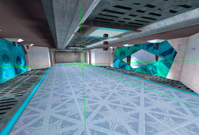
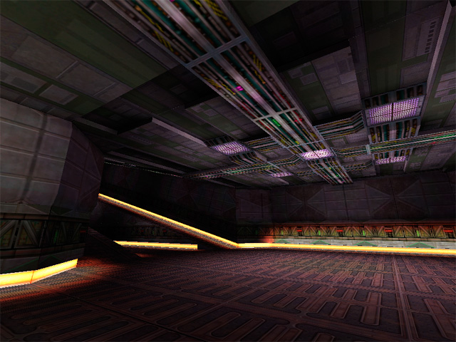
You can see in this screenshot, weve got 3 light objects near the light source. One is a spot light source that cast shadows. One source is a point light source that didnt cast shadows, to simulate bounce lighting. The last light is specifically for lighting the characters.
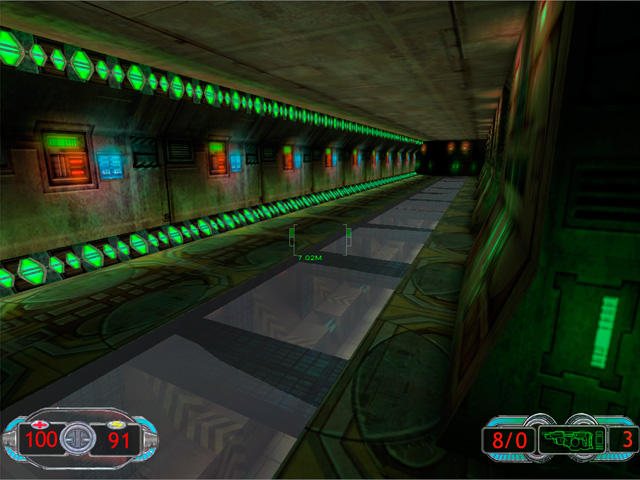
Texture lights are a brilliant invention, and I havent seen them in any other engine Ive worked with. The basic idea is that theres an editor that allows you to define lights that are attached to a particular texture. Wherever that texture is placed, the engine knows to render the lights specified in the texture light definition.
This screenshot is lit entirely with texture lights.
Another thing I think we did right was to have a single main texture artist for the environments. Jamie Burton painted a large majority of the textures for this project. Not only was his vision for the textures very cool, all the levels had a sense of artistic coherence from his work. As youll notice from some of the screenshots, the wall texture detail is pretty subdued. This is important in a first person shooter, where its important to be able to pick out your target from the environment. In the scenes that work the best, we put most of the detail into the floor and ceiling.
The skills I was missing that would have had the biggest impact on the lighting quality of Shrapnel are: Lighting Hierarchy and Lighting Color Palette.
Lighting Hierarchy is an important concept that I am just beginning to wrap my head around. The general idea is similar to that of Key, Fill and Special lights that create layers of light and help the player understand the meaning of the scene. For example, the scene has a set of lights that make up the primary illumination for the primary purpose. In this case, its seeing your target. The secondary lights then highlight elements like doors, paths and other game-play elements. The tertiary lights might serve to highlight architectural details, signage, or other smaller elements. Theres an excellent article on lighting hierarchy in houses of worship written by Robert Shook and Michael White of Schuler Shook on ChurchExecutive.com.
The lighting hierarchy in this image is a bit messed up. The purple lights in the ceiling should be creating a majority of the illumination. The yellow light strips should be more subdued and act as accents to help the player understand the space better.
Lighting color palette is important to help define the lighting hierarchy, establish mood and give cues to players where there is something that requires special attention. Color theory has never been my strong suit, but theres a book I re-read occasionally and always get something good out of called: Color Choices: Making Sense out of Color Theory, by Steven Quiller. He explains all about different kinds of palettes and how to pick colors that will be harmonious or contrasting, while maintaining visual coherency. I highly recommend it.
Mark Long, the co-founder of Zombie, has a history of championing game projects that have a unique visual style, so between Jamies textures, the environment artists pre-fabs and some of my lighting, we made a number of really interesting spaces.
Lighting Post Mortem Gabriel Knight 3
December 27, 2011
Gabriel Knight 3 is a real-time 3d adventure game, developed by Sierra Online, and it was my first job in the games industry, back in 1997. When I was hired at Sierra, I was a year out of college, and most of my CG experience was creating pre-rendered artwork for personal projects. I had never worked on a game and I knew very little about real-time 3d. Lighting has always been a passion of mine, but at the time I had no real experience lighting spaces for games, and not much of a grasp on color theory.
An example of my rendering work, prior to joining Sierra Online. Created in Strata StudioPro.
The art development for GK3 was done using 3ds Max 1.2, and rendered by a custom rendering engine designed by Jim Napier and Peter Freese. We exported our scenes directly from Max, and rendered lightmaps in a custom tool. At the beginning of the project, the game engine rendered our lighting as a multiply pass on top of the diffuse textures. A process I had no experience with, coming from a pre-rendered graphics background. I spent a long time trying to figure out why I could never make my scenes as bright as I wanted.
When Peter came on the project, he introduced me to the concept of a MOD2X render process, which allows for both brightening and darkening of the diffuse textures using the lightmap textures. MOD is short for modulate, which is the same thing as multiply. When multiplying low dynamic range (8 bits per channel) images, you can only darken, since the values in your inputs can never be above 1.0. The MOD2X helps us get around the darken-only quality of a multiply by increasing the lighting amount in the calculation by 2. Here are the equations:
MUL Lightmapping: diffuse*lightmap = final surface
For example, if the diffuse texture brightness is 0.5 and the lightmap is 1.0 in the light areas and 0.25 in the dark areas, the final surface will range between 0.5 and 0.125 brightness. In the light areas, the final surface doesnt change value at all and in the dark areas, it gets darker.
MOD2X Lightmapping: diffuse*lightmap*2= final surface
With the same diffuse and lighting values as the MUL example, the range becomes 1 to 0.25, so its doubling the lighting values compared to MUL only.
The downside of MOD2X, is that it becomes possible to create a final surface that is brighter than the rendering engine can handle and will be clipped to 1.0 (white) during rendering. The lighting artist always has to balance texture albedo with lighting values to make sure lighting in the scene doesnt clip to white in an unnatural way.
After I knew about MOD2X, I wondered why anyone would use MUL only lighting. I think part of reasoning behind using MUL was a graphics hardware issue, and the other part it was a judgement call on how the textures should be authored. With MUL only lighting, you make your textures a bright as you ever want them to be when fully lit. With MOD2X you would author your textures so they could be both lit and darkened without going to pure white or black.
For every project, the lighting must have a primary goal. On GK3, atmosphere was the primary goal. We were building a slow-paced mystery-adventure game that was supposed to be spooky, so we needed the lighting to create that feeling. It was less important to have easy target recognition, or a sense of high speed, or some other game-play related goal.
Because of the 3rd person view of the game, it was important that the walls, floor and to some extent, the ceiling to be lit with equal care. Not every game requires the same amount of attention to each angle. For example, in a first person game, the walls will be the most important surface to light, since they will be the largest part of our view.
The lighting rigs I worked with on GK3 were designed by our art director, Ron Spears. For outdoor scenes we had two direct lights. One for the sun, and one for the sky. The sky light was placed opposite the sun angle and perhaps a little steeper depending on the scene. For artificial lights, wed use point or spot lights. These were all standard light sources in Max.
The main lighting challenges we had during GK3 were:
Though I knew very little about lighting environments when I started the project, these are the areas of knowledge that would have had the most positive impact, had I known them:
Using lighting to assist with way-finding. This means using light to help the player know where to go and what to look at. Often times, the artist must put in special lights that are cheated from the key light direction in order to highlight an important surface or object.
Lighting color temperature. We needed more consistent and better thought out values for all our lights. Many artists tend to think of light colors as absolutes, but our brains are constantly trying to neutralize the colors we see. A big shadow that seems blue when we look at it, will desaturate when were standing inside of it. I dont know of many rendering engines that will do this kind of compensation. Because of this, lighting colors are either too saturated or not saturated enough. It can help to define light color ranges that are different depending on the color of the key light in the scene. Warm lights that are used with cool daylight will be more red and saturated than when warm lights are used exclusively. We also missed a chance to influence mood further by using the light colors thoughtfully.
Creating strong directional lighting to bring visual depth to a scene. This is not always necessary depending on the lighting situation, but it can increase how easy it is for the player to read the space. I feel a lot of our scenes were visually flat, and really needed more play between light and shadows. In animation and stills this is easier, since you have a key light that will be used for that particular scene. In real-time 3d worlds, the player is moving around all the time, so a key direction that works from one set of angles will be sub-optimal for other areas in the scene. One way to make this easier is to design the scene geometry with this in mind, and allow opportunities for directional light indoors.
This seems like a no-brainer, but anything lit by the night sky will be darker than the sky. All our night skies were too dark.
My own misplaced confidence in my abilities might have been my worst mistake of all. The person I worked most closely with, Chris Brockett was very good and lighting and texture work, but I was so wrapped up in my own vision, I missed an excellent chance to learn from him.
Although this is one of my more successful lighting set ups from the game, you can see a number of the flaws: The lighting does not clearly indicate whats important to the player, the sky is darker than the tree silhouetted against it, the street lamps cast distracting shadows, and the colors are not very evocative.
Chris Brockett, the other main environment artist on the project had a far superior grasp of light and color than I, which you can see demonstrated in this screenshot of the temple.
We had a few different art directors during the course of the project. When I came on Ron Spears was the art director. Later on in the project it was Mark Peasley, and then Richard Hescox came on at the end. Keeping consistency in the art was difficult with these changes. However I learned a number of good things about lighting from each art director. Most notably:
We did a few things to help the lighting be more consistent throughout the game. I made a single outdoor lighting rig for each time of day, and an orientation map for each scene so that the sun angle was consistent across connected scenes.
For further reading on the environment art development process of Gabriel Knight 3, heres an interview I did with Nico Sels, who runs the SIDNEY web site, dedicated to GK3.
Interview
November 29, 2011
I was recently interviewed by a student from the Interlake High School in Bellevue, WA for their project in 3d art. This is a slightly edited version of the interview.
Q: In your 3D projects there is always presence of contrasts between light ares and dark areas, do you plan those ahead or are they just coincidences?
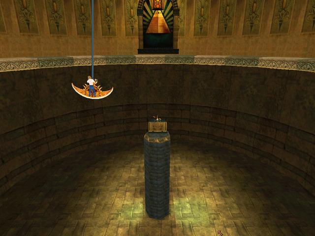
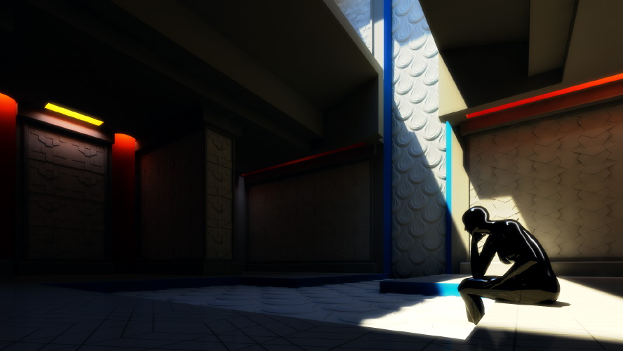
A: The visual contrast between light and dark in my pieces is usually planned carefully. Light/dark contrast is a way of making something visual stand out from the other things around it. Think about a stop sign which is red. That red color is usually very different from the other colors around it like green leaves or white buildings. I use the same kind of technique, lighting certain areas of an image to show off the curves of a vehicle, the placement of a figure, or to move the viewers eye around the picture. In my Patten Temple project, I use a shadow to act as a dark background for a lit figure and a light background for a dark figure. This helps the figures to stand out from the background.
An image from my Pattern Temple project
Q: How much time does it take you to realize a project like those shown on internet?
A: The Pattern Temple project took about 200 hours. I consider this to be a pretty long for the amount of detail in the final images, but I was experimenting with the lighting design for a long time, and changing the building significantly to control the light. I was also working with another designer, making the patterns to his specifications, and incorporating some of his ideas, which required a lot of revision time. This is not a typical way of working for me, since usually someone else designs the environments and then I light the environments they have built. I spent a year creating the lighting for Forza Motorsport 3, so thats about 2500 hours of work, but it was a very large project. On the Sega Rally Revo project, it took me about 4 days each to model, texture and light the vehicles. As you can see 3d artwork is very time consuming.
Q: I was also curious to know which program you used to create the car racing tracks and what you have learned through doing those projects.
A: My primary software for the last 12 years has been 3ds Max. Thats the application we used for all of the Forza games. I always learn a lot on every project I do. It would be time consuming to list all of the things Ive learned on each project, but in general what I learn falls into the categories of 1) art 2) technology 3) planning 4) working relationships. Im always reading books or online to expand my skills. I try to apply these new ideas to each project. Theres also so much to learn from the people on each project. I feel fortunate to have found places to work with people that are more talented and smarter than myself. I think thats the best way to learn.
Q: I find your patterns, the buildings as well as your whole style really modern, compared to for example gothic architecture, what pushes you to make your buildings in such a modern aspect, mostly architectural wise, like the roofs being low, and pretty flat?
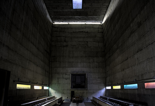
A: The patten temple was designed to showcase the tile patterns I was designing for a client. Since the pattens were supposed to feel modern, I designed the building in a way that I thought would work with the modern patterns. However, the base of the building design feels somewhat ancient Greek/Egyptian to me. The large slabs and small openings are Mediterranean in flavor, since they will block a lot of the hot, direct sun. The large opening in the roof was to let enough direct light in to show what the pattens would look like next to a large window on a sunny day. Many people who use wall patterns from the company I was working with (http://www.modulararts.com) will use artificial lights to create grazing, colored lights on these patterns. I wanted to show these types of lighting conditions as well as more direct sunlight conditions, all using the sun as my only source. This was the plan behind the design of the temple. The lighting design was inspired by Le Corbusiers Monastery of Sainte Marie de La Tourette. I discovered the monastery, when I read an excellent piece about it in Marietta Millets book Light Revealing Architecture.
Heres a nice shot of the monastery lighting in action by Chris Lawrence
Q: I was also wondering were your inspiration comes from?
A: I get my inspiration from many places: books, games, artwork, life. Its always a good idea to step back from your work, and do something unrelated. Julia Cameron calls this refilling the well in her book The Artists Way. As artists we need new ideas, new experiences, new inputs to help us remain creative. If we keep looking inward for creative ideas, eventually well run out. We need to try new things, go new places, learn different ways of sensing, or our art will become stagnant.